Thank you to Varun, who always, though reluctantly, poses for all my shoots 🙂
Poster Shoot #2
Thank you to Varun, who always, though reluctantly, poses for all my shoots 🙂
Madhu Maam posing for my poster shoot!

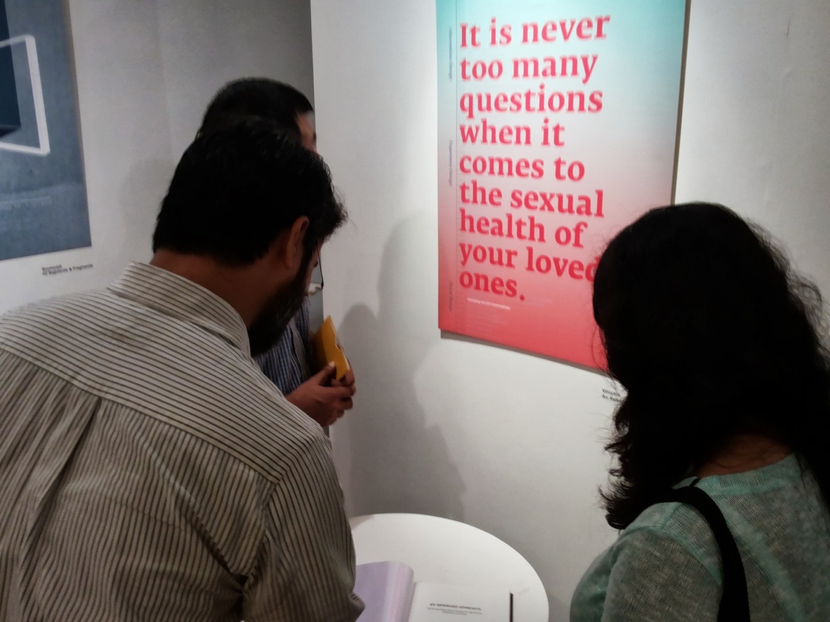
Design Route at the Graduation Show. 🙂 A big thank you to Anisha for these images.
As seen by my cell phone camera.
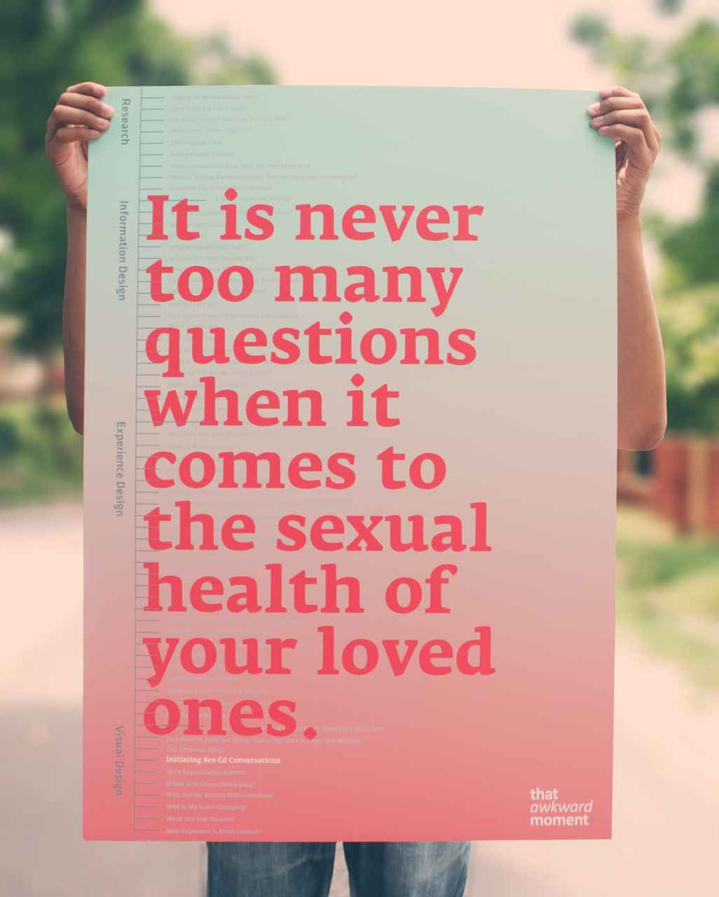
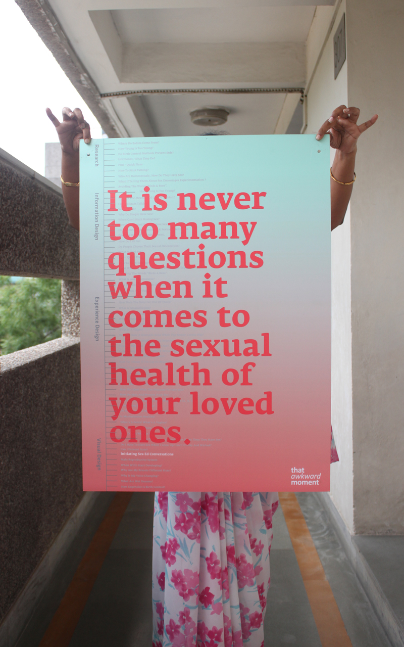
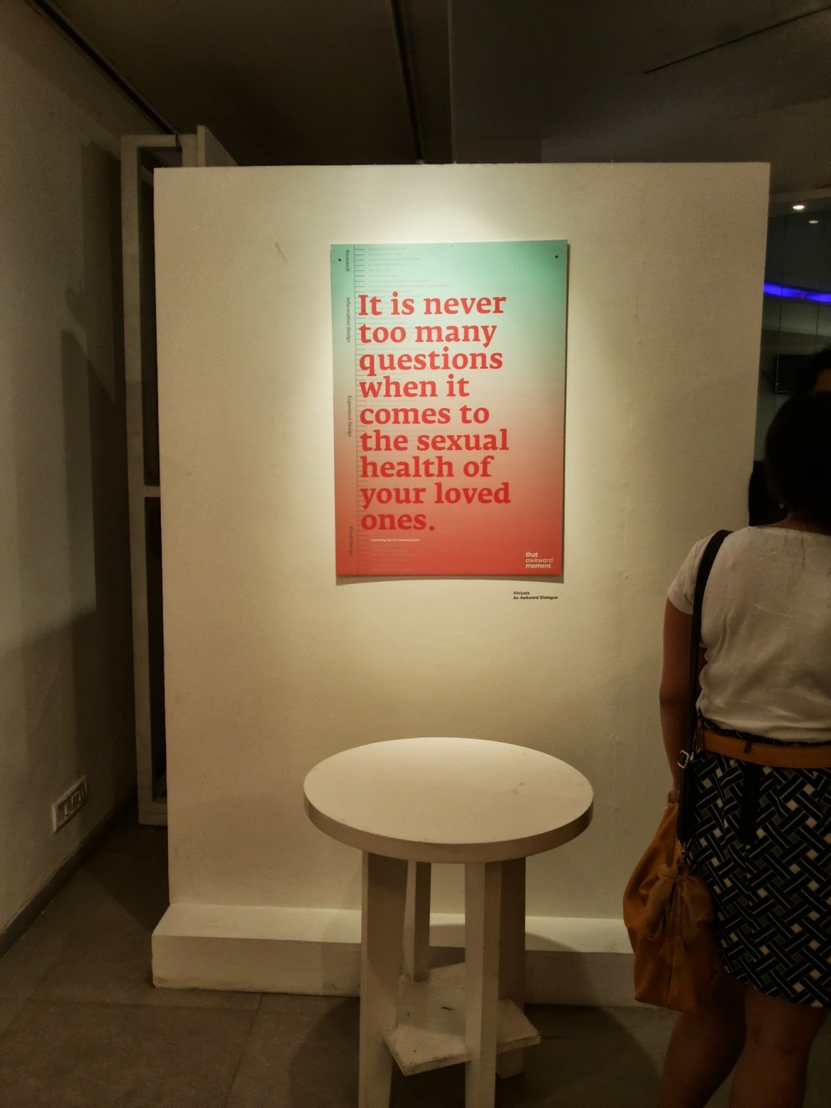
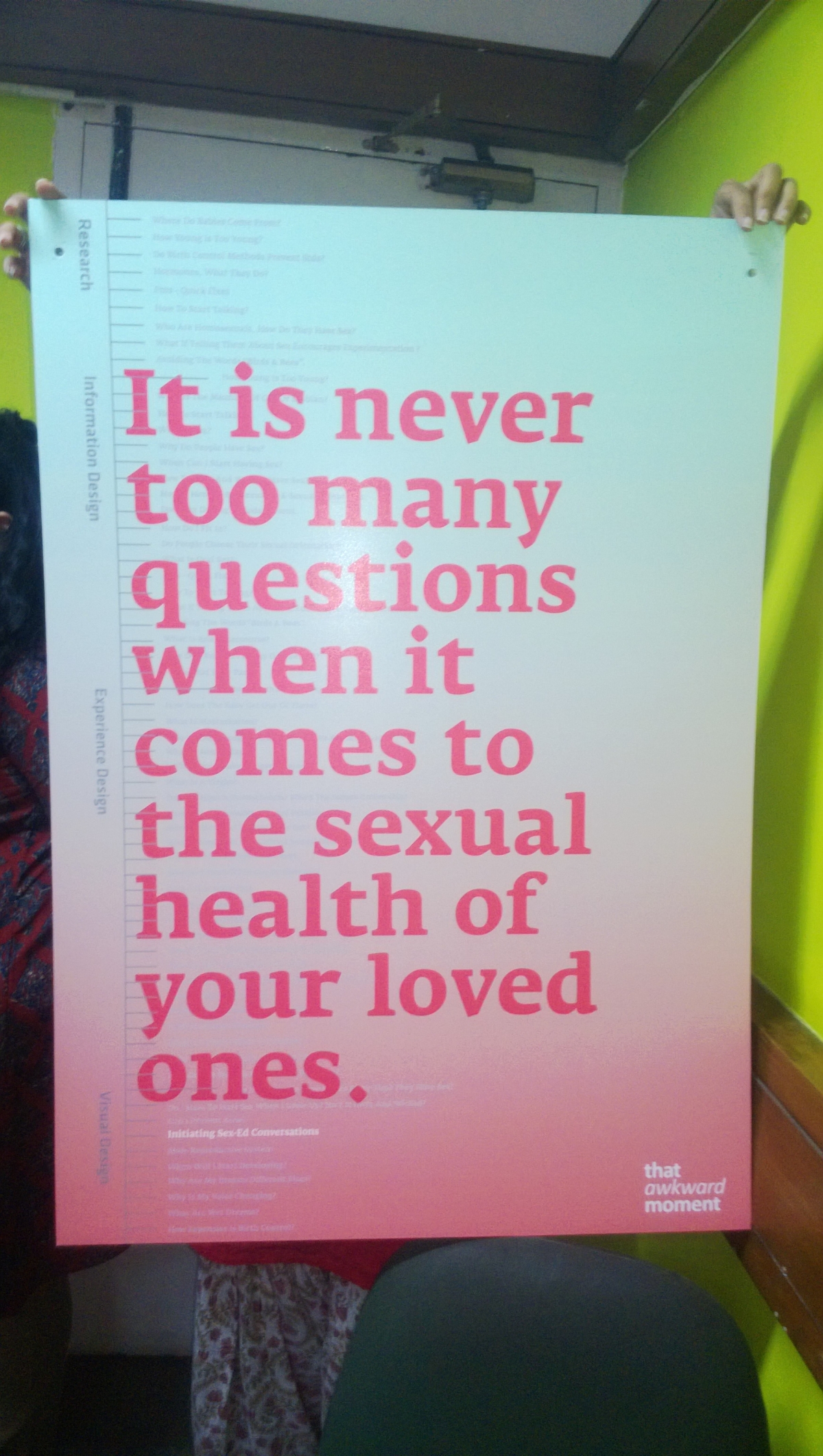
This is the final poster that I put up for my graduation show. The poster talks about the core essence of the project’s intent and subtly directs one to notice the solution as well. I should be able to post a better image soon.
The project has reached a conclusive phase and I, finally graduated.
So what really happened to the project. Within the constraints of 4 and a half months, I managed to do a thorough research, find a valid problem, design a brief, understand information design and architecture – apply it to the context of my project, work on the intricacies of the sensitieve content and develop the content in a manner that would be socially viable, struggled to design a user experience and ultimately came out with one single draft of the user interface.
Having put in so much work, a single draft sometimes seems disappointing, but the journey was remarkable. The fact is that I was fortunate enough to have gotten the opportunity to do such a project and learn so much from it. This one project has introduced me to so many new skills that I want to further explore and hopefully, someday master.
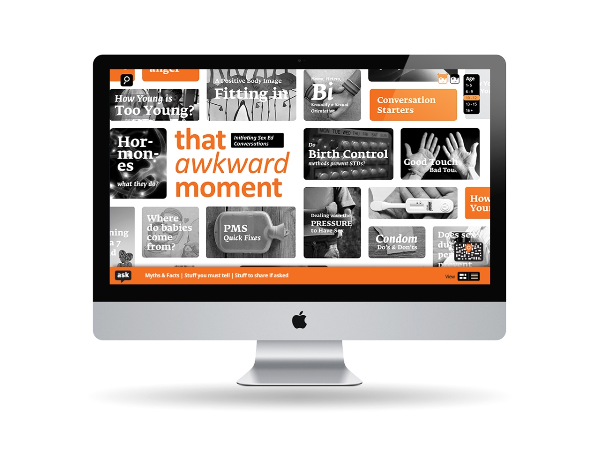
The communication strategy I designed for the product includes a Campaign, a Wep Portal and a Mobile Application.

I have however, only worked on the website as of now. Here are a few screens of the interface.
1. Home Page
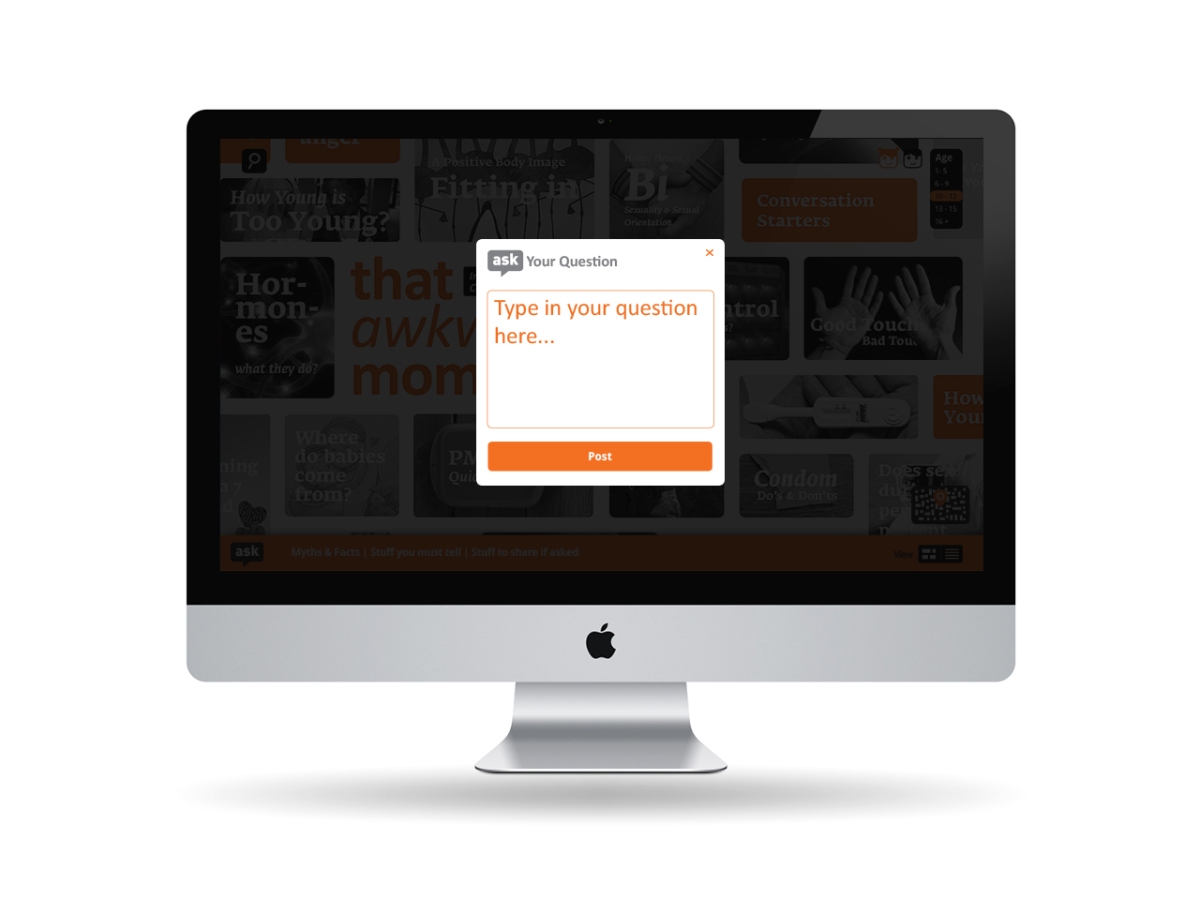
2. Ask A Question Page – A User may, at any given point, ask a question that will be answered by other users and monitored by a panel of subject experts.
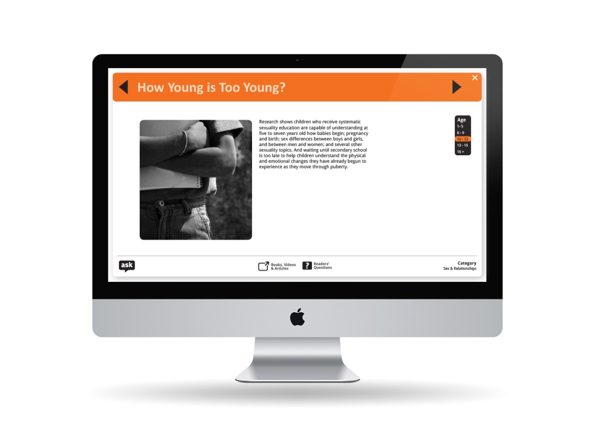
3. Main Information Page – Once a User clicks on any one of the flash cards on the home page, he would be directed to a page like such, that holds the required information and directs him to more resources for a better, more detailed understanding.
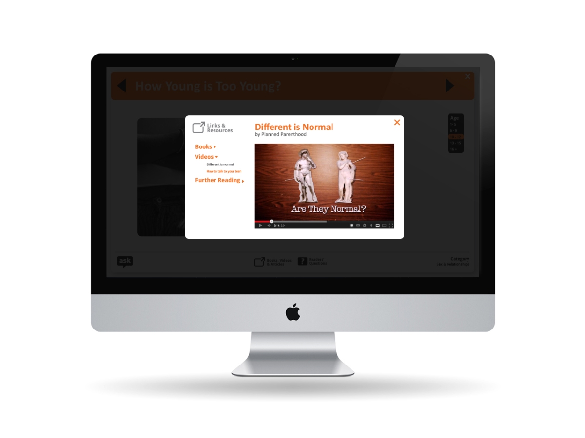
4. Links & Resources Page – The User, from the main information page, can navigate to this page, where he is offered a variety of links, resources and related content for him to get a better understanding.
Documenting the project for my final evaluation; and strangely, even after having gone through all my old notes, I can’t remember anything.
Working with so many quiz formats as my method to impart information, I began to really evaluate the idea again. What I found was this:
1. The act of acquiring information for the user, could seem gimmick-like at some point.
2. The fact that all the questions are mostly, seemingly testing one’s knowledge about a particular topic, could be intimidating for a first time or less aware user.
3. Quizzing could become competitive and one may just focus on answering correctly and lose interest in the information itself.
4. I explored various forms of questions and answers, put them all together in a format to see how well they work as a unit. The questions seemed flat and there was no particular engaging factor in the format.
5. The format lacked the natural quality to bind all forms of questions together. The format, hence, never fell in place.
How can I have all these different questions in a format that best suits them? Is quiz the right way to go? I tackled a lot of questions, I re-evaluated my intent and almost 3 weeks before my deadline, I decided to let go of my previous interface and start wireframing a new one.
Designing a new experience.
The new wireframe & I, sought out to bring all the different forms of questions, advice and information together on a single, most appropriate format.
This new concept explicitly deals with one’s need to get an answer to ‘a particular question’. I imagine the user to be conscious of the importance of a dialogue about sexuality education. They have accessed our website to get a particular answer or just to get an idea of what all could be the possible questions that they might have to face – basically our user is aware of the intent of the product, which is to tell him how to answer a question.
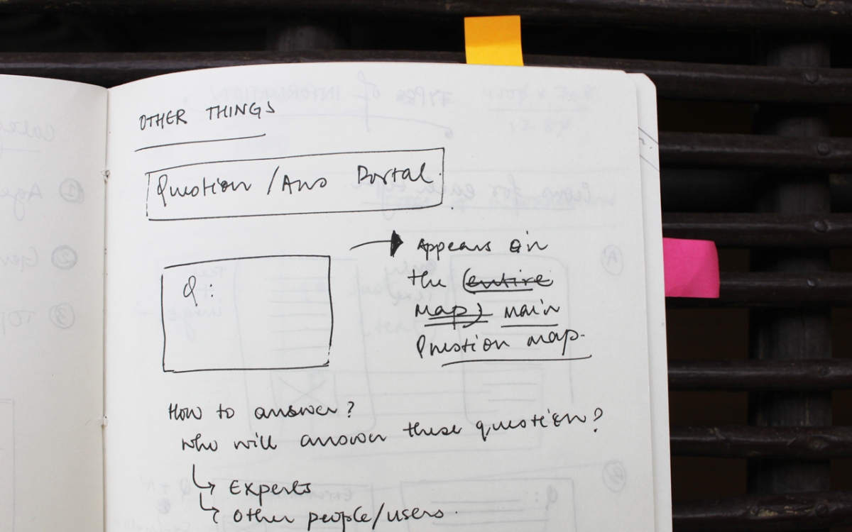
Now, to do this, the content had to structured in a manner different from the previous iteration. This time, it was divided into four forms of information:
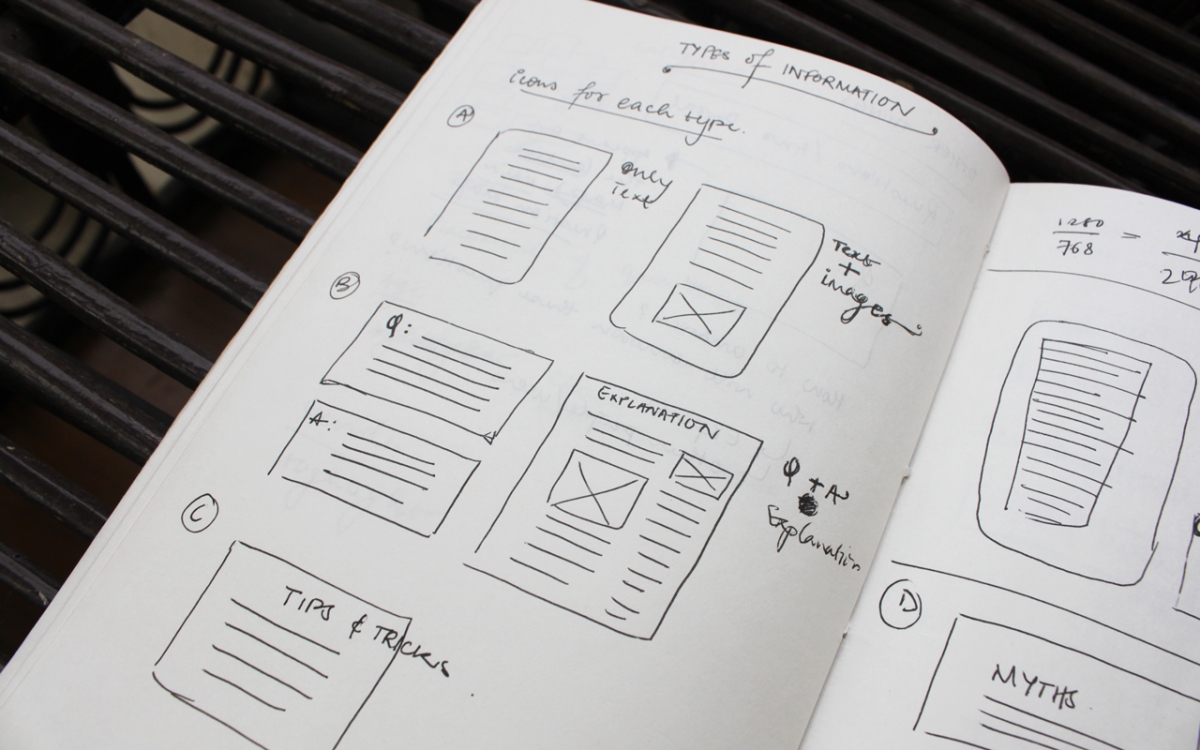
1. Question/Answers (topics & their explanations) – That an adolescent must be aware of at his/her age.
2. Question/Answers (topics & their explanations) – That an adolescent may just happen to ask because he saw something on the TV, etc.
3. Myths & Facts
4. Tips & Advice on how to carry forward a conversation that may turn awkward.
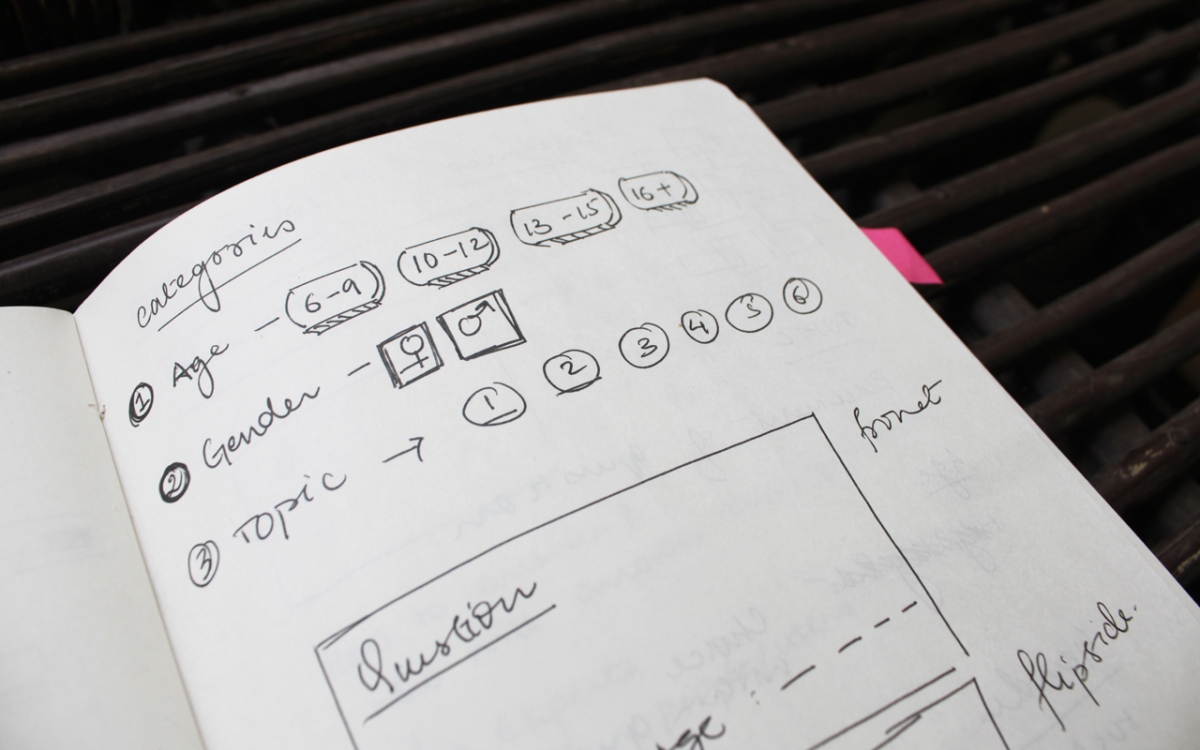
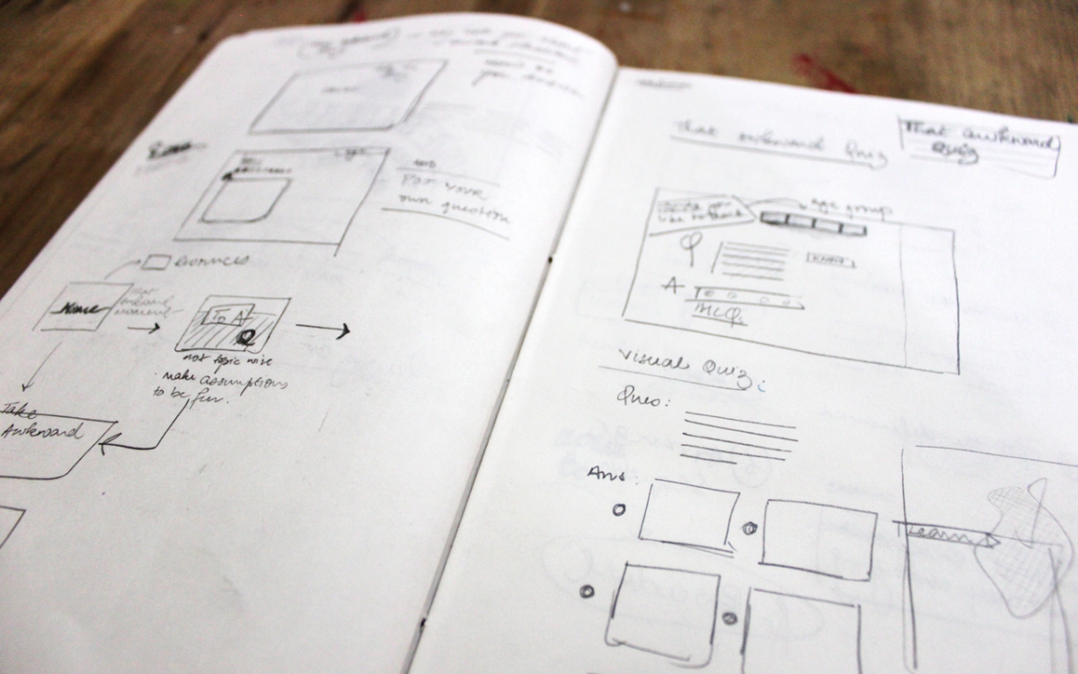
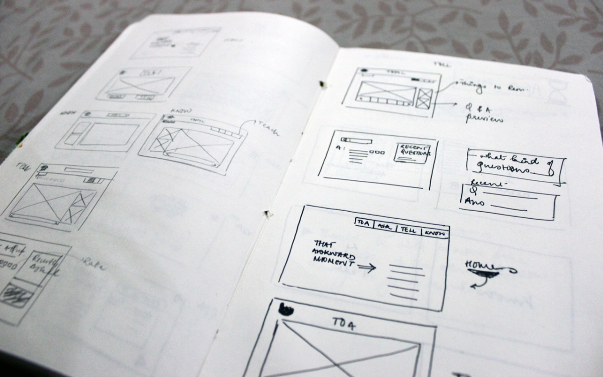
The information required parallel categorization. There was age, topic and gender, besides the four types of information categories. Keeping all this in mind, I started working on the wireframes. Spending an idle day with no work to show for, I gave the wireframes a pause and put down the storyboard (i had in my head) on paper. This exercise really helped me to be conscious of all the thoughts I had stuffed inside my brain. I could channelize them much better, this time around.
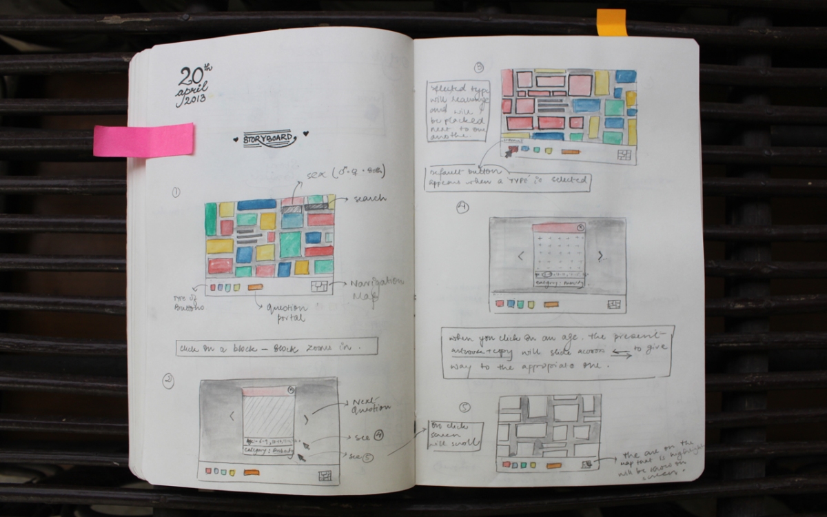
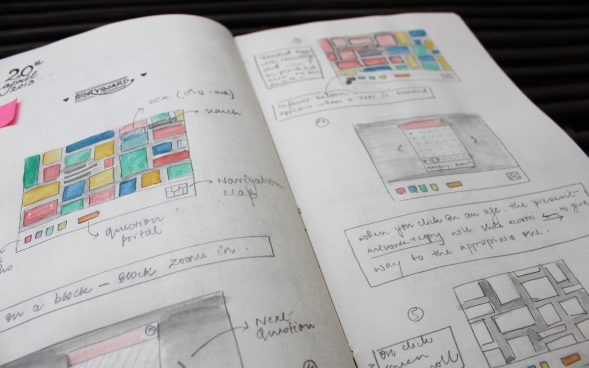
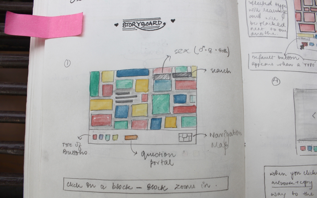
Some more things that were added to the storyboard were a portal where one could ask his/her own question. This, I believe is a very important aspect of this project.
This new approach, as I envision it to be, is very hands on. The user controls his/her navigation, content categorization and at point, flow. The interface is seamless and one can jump from one piece of information to the other as per the category filters they choose. It equips the users with the answers they want, while at the same time, providing an opportunity to explore through questions that they never thought of.
Next up…the new & improved wireframes!!
“So much to do in only so many hours in a day” – Vienna, Billy Joel.
With a few refined drafts in place, I began to work on the content and the visual styling – mostly the visual styling. I looked at illustration styles that would work – colors, buttons, etc.
On 10th April I made another quick visit to TARSHI to meet Prabha Nagaraja. Learning: Getting a third person view on any project (in this case, a subject expert’s) can never be a bad idea. There have been a lot of changes in the project since I last met Prabha. I told her about the learn to teach idea where one gets to know exactly what, how and how much to say to a curious adolescent(or child). The discussion panned out to be more inclined towards content and filters.
1. The content must make the user feel secure and settled and not anxious. It should not sound moralistic or preachy.
2. One of the most important points of discussion, was creating filters for the website. Sexual predators may use this information as an excuse to get close to children. The misuse of such information, was a great concern. I was sensitized to the worst case scenario and in turn, compelled to research the various disclaimers and filters one may need to keep the website as effective and as fool proof as possible.
3. Another very important issue raised was how can we measure how much the user has been able to learn. Now, keeping the focus on learn (and not teach yet), there is no way we can get a learning feedback. To tackle this, Prabha suggested the inclusion of certain questions that would help the user actively reflect upon what he/she was able to grasp. Such a tool would help the user break away from a passive information consumption phase to actively learning and thinking about what he is learning.
4. Questioning could be a great format for the user to actively participate. We also spoke about quizzing, as a learning tool and levels of achievements as reward points for the same. The user has to be lured into first, begin to read the information, and later, stay on and explore more.
The sex-fu challenge is a good example of a quiz. Although the idea is nice, I felt the quiz structure is a bit too rigid. One cannot move past a particular level until he/she has answered all the questions in a particular level. There is no way one can see the next levels, until every question is answered. Coming to the questions, they are textual and the ‘All Caps’ treatment is a bit jarring to read. Nevertheless, it was a good start for me to be looking a quizzing as a learning tool.
Random Thought : “The project just seems endless sometimes”.
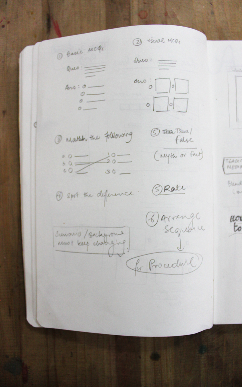
I came back to work with a lot to do. The discussion led me to shape the learn bit into a quiz format. I looked at all the information together and brainstormed on how can my quiz not be flat and boring. I looked at different types of quizzes and formats the information could be imparted in.
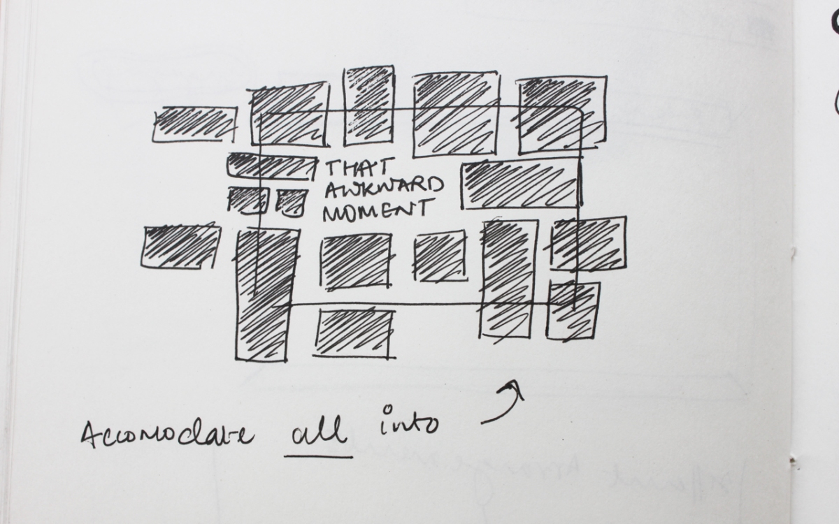
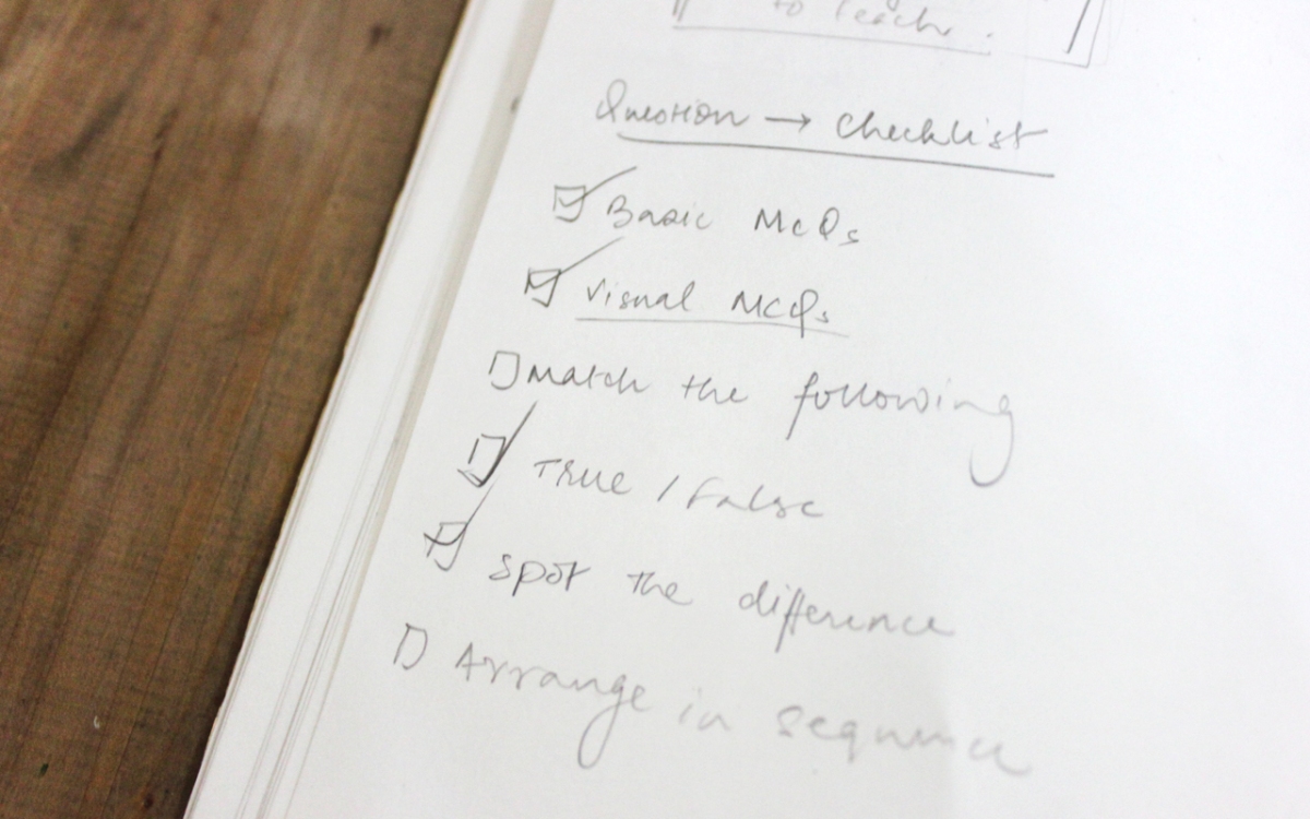
And so, ‘That Awkward Quiz’, came in to being. Various formats like fill in the blanks, replace a word, match the following, spot the difference, multi-choice questions, etc. The new wireframe had to accommodate all the type of questions.
Bad idea: Delving into the visual imagery before the wireframes have been finalised. But I can never refrain myself from doing that. I have however, noticed that when I dont think of the visual styles while wireframing, I work faster and the quality of ideas is much better. One thing at a time. One thing at a time!
Question Checklist. It still needs to be worked upon. A lot to add and a lot to remove.
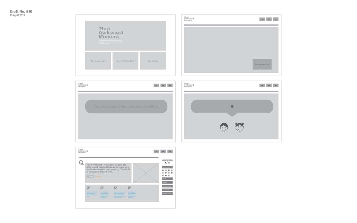
Draft #10
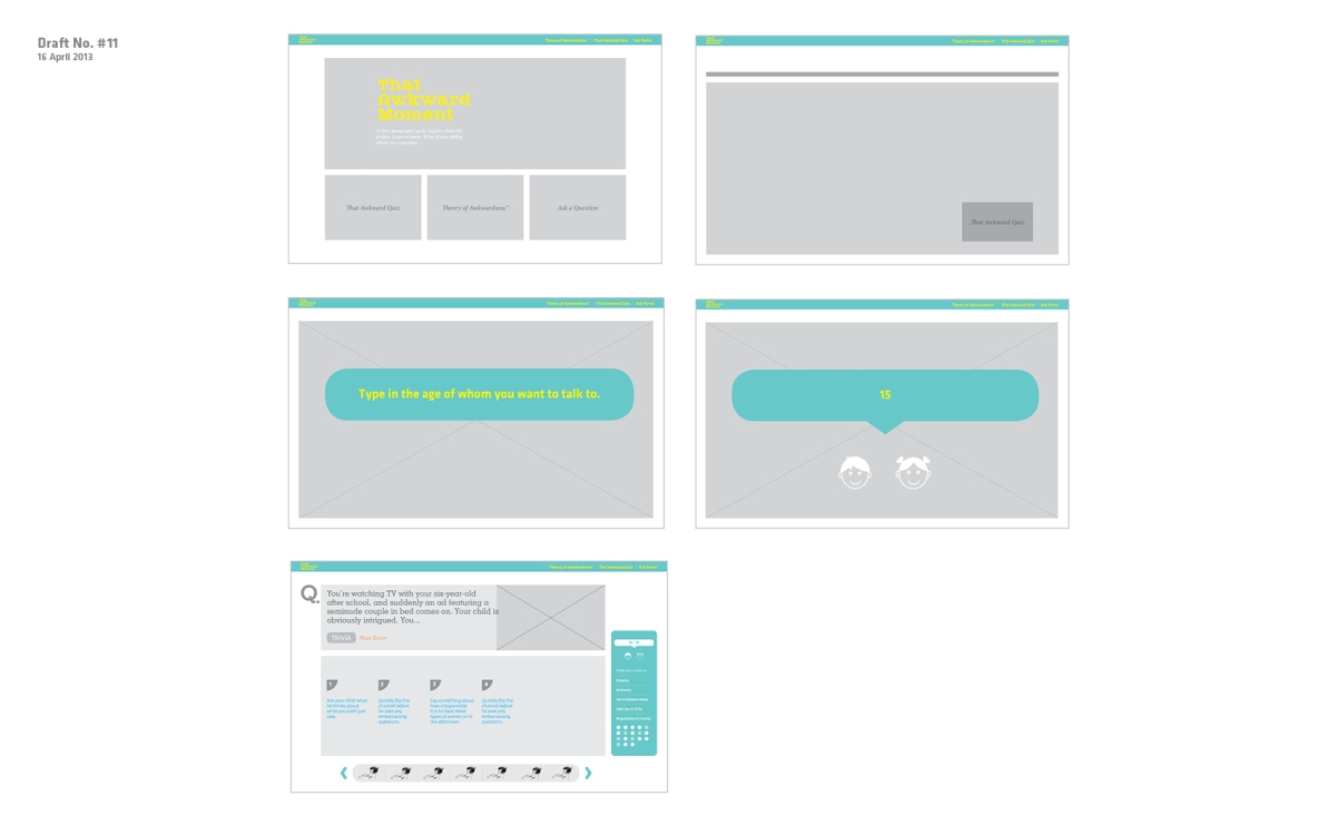
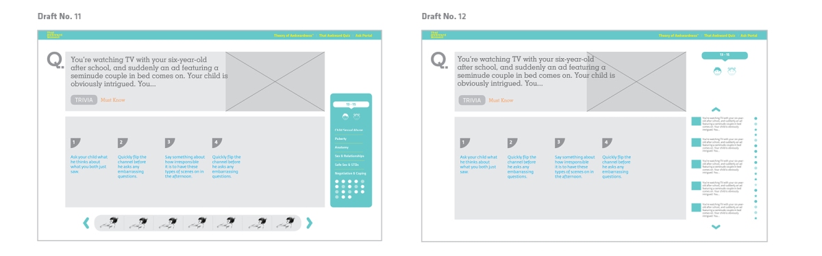
Draft #11
Draft #12
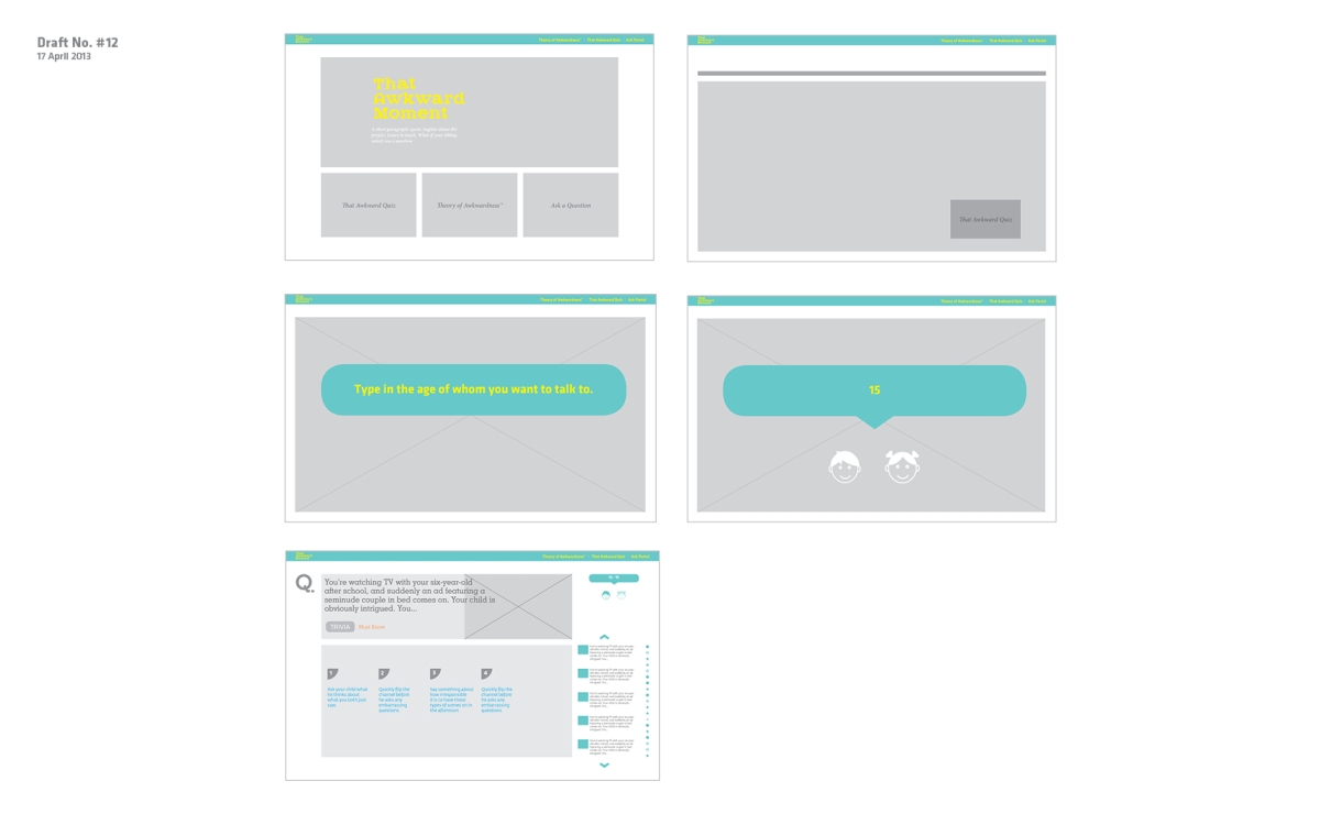
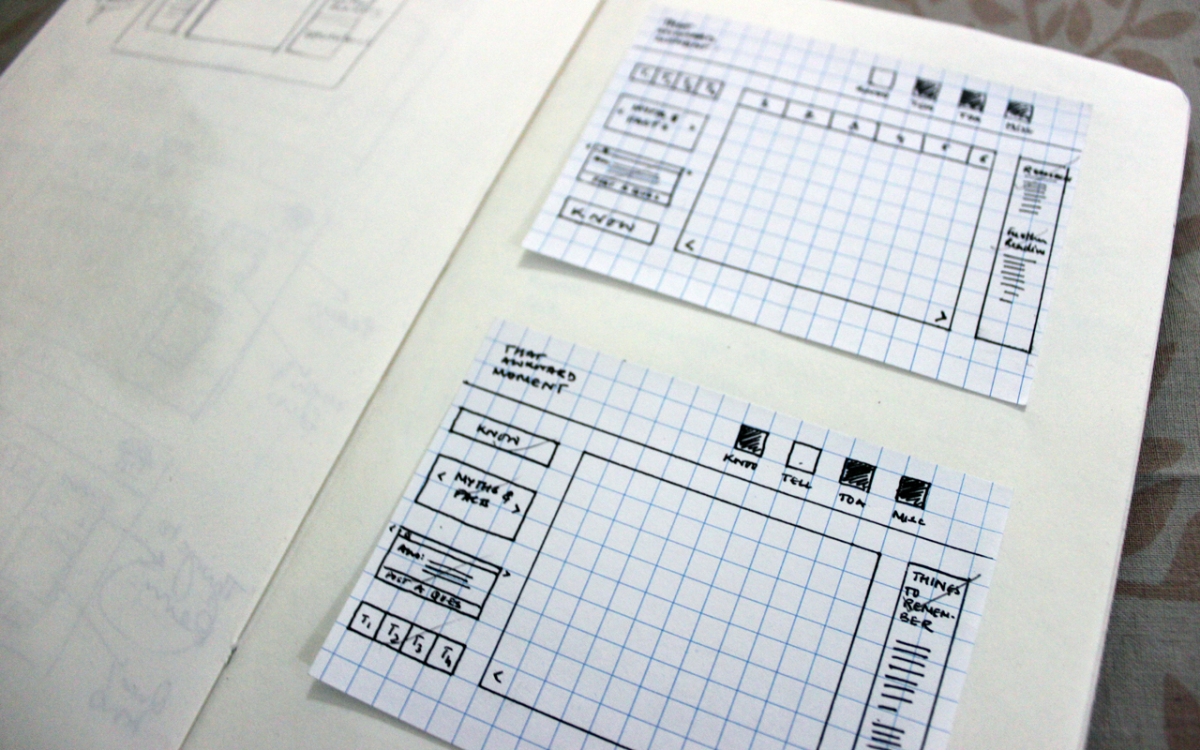
Wireframing the quiz.
Below, is a comparison of the quiz pages from draft 11 & 12.
Naturally, the wireframes needed to be worked upon. This entire week was dedicated to just that! After the first and second drafts seemed to be magnanimously faulty, I worked on a few more. The problems with the initial few drafts was that they seemed more like a publication and were not engaging enough in the web format. To avoid the same mistake again, I studied a few UX principles, looked at designers’ processes, tried to analyze a few websites and of course, learnt some new UX terminology.
This seminar from the Gamification Summit 2012, I thought was very interesting. It gave me a starting point and vaguely a benchmark, too. On a lighter note, I also found the UX drinking game designed by Patrick Neeman of Usability Counts LLC.
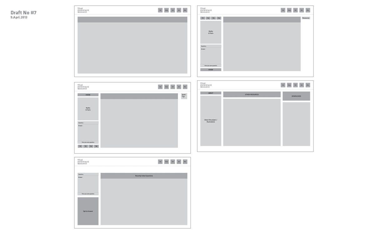
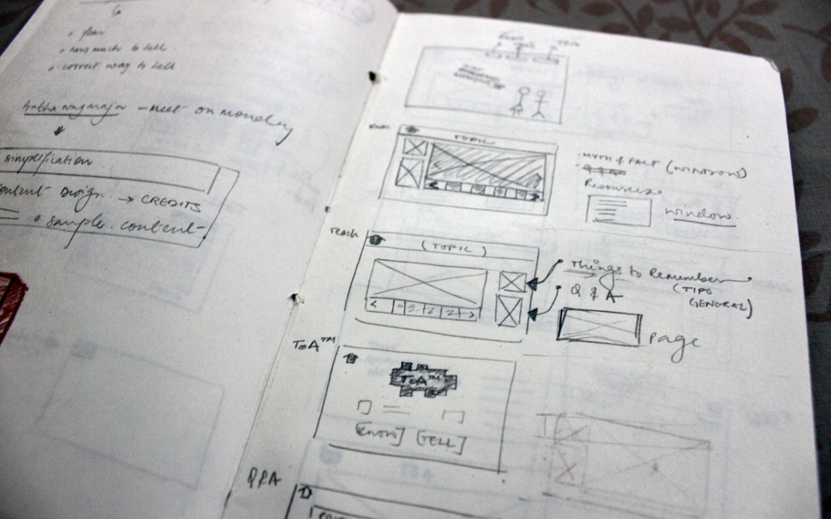
Now, coming back to the wireframes, here are my next few drafts. There are four basic anchor points apart the Home Page.
a. The Know Page: This is where one would learn about the different topics.
b. The Tell Page: Here they would learn how and what to tell/explain the topics if someone younger asks them.
c. The Theory of Awkwardness Page: This page enumerating the reasons and the situations in which one is or can awkward. It has a very light and often comical tone.
d. The Miscellaneous Page: Resources, Downloads, Questions, etc.
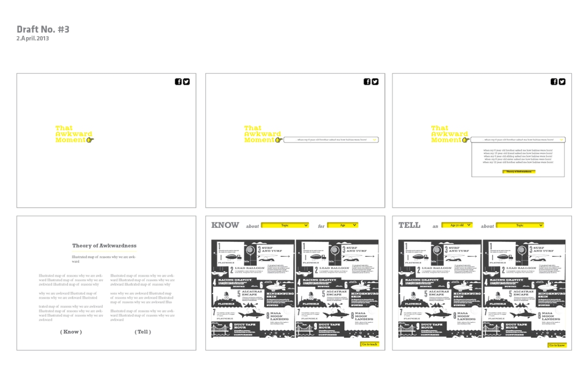
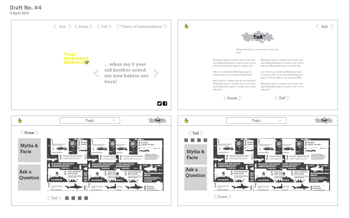
Draft 4, became more refined. Though the Know & Tell Pages could be accessed separately they looked fairly similar. This was done so that the user feels like he can quickly toggle between the two sections.
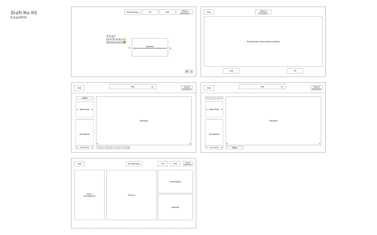
Draft 5, based on the previous draft has smilar qualities and intentions, but is more organized as an interface.
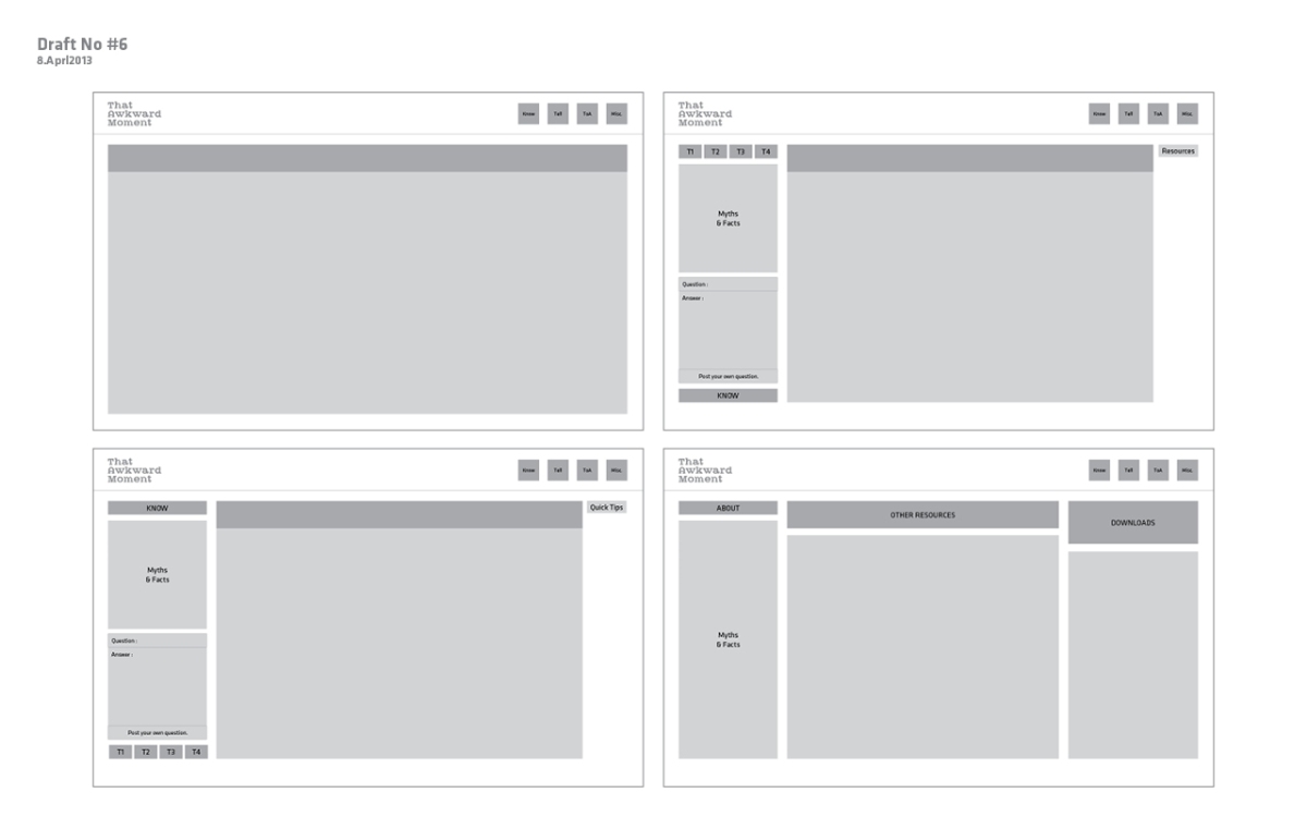
In Draft 6, I did away with the so called Home Page. The Theory of Awkwardness would now be treated as the users’ first interaction with the product. The interface is treated in a manner where one can navigate freely, from one page to the other without having to go back to an anchor page. There is no home page anymore.
During this week, I also met my friend Ananya who has a younger sister, almost 10 years old. Never having been spoken to about sexuality, by an adult, during her growing up stage, Ananya mentioned her concern for her sister stepping into puberty soon. She plans to have a conversation with her own sister but her biggest worry is – “What exactly do I tell her?” She really needed someone to guide her through this conversation, and if possible, answer her queries. This brings me to Draft 7, where I included an ASK Page – For all the questions one may have with regard to ‘the talk’ or just to responsibly answer a younger person’s doubts.